PANTONE color of 2017 – GREENERY!
The PANTONE name is known worldwide as the standard language for color communication from designer to manufacturer to retailer to customer. The Pantone Color Institute announced their pick for 2017.
” A refreshing and revitalizing shade, Greenery is symbolic of new beginnings.”
“Greenery is a fresh and zesty yellow-green shade that evokes the first days of spring when nature’s green revive, restore and renew. Illustrative of flourishing foliage and the lushness of the great outdoors, the fortifying attributes of Greenery signals consumers to take a deep breath, oxygenate and reinvigorate.”
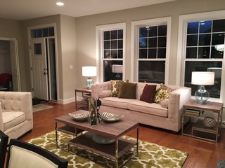
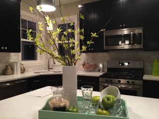
Everyone will begin to see Greenery more and more in fashion, magazines, on commercials and in all advertising. It will become a familiar feeling. We want to use Greenery in our staging to invoke a memory to the future home buyer. We want them to remember this home.
You want the home to be mostly neutral with touches of color. Never overdue one single color in a space, it will overwhelm and give an unfavorable look. Remember, you are trying to sell the home, not the furniture. Greenery is nature’s neutral. It is trans-seasonal and will blend well with neutrals, pastels, brights, metallics and even the two 2016 colors of the year, Rose Quartz and Serenity. So no need to replace all of the accents and artwork that you have, just add in a few new ones on trend. Make a room pop by using a cream couch and a Greenery pillow. Revive a room with an artificial plant or potted grass. You want that future home buyer to feel as if they’ve just walked into a page out of their House Beautiful Magazine. They dream of buying that home.
Final thought…Greenery is the color of Hopefulness. Rejuvenation. Fresh New Beginnings. Letting go of technology and reconnecting with Nature. We all know what kind of world we are living in: uncertain and stressful.
We could All use a little more Greenery in our lives.